Essential Elements of High-Converting Product Pages
Learn which page components actually influence purchasing decisions and how to structure them for maximum impact.

Why Product Pages Make or Break Your Sales
Your product page isn’t just a display window. It’s where the actual decision happens. We’ve worked with dozens of online stores, and the difference between one that converts at 2% and one that converts at 5% isn’t always about traffic quality—it’s about how the page is structured.
Think of it this way: a customer lands on your page, they’ve already decided they’re interested. Now they need confidence that this product is worth their money. That confidence comes from what’s on the page and how it’s organized.
70%
of customers read product descriptions before buying
85%
want to see multiple product images
64%
abandon carts when shipping costs aren’t clear
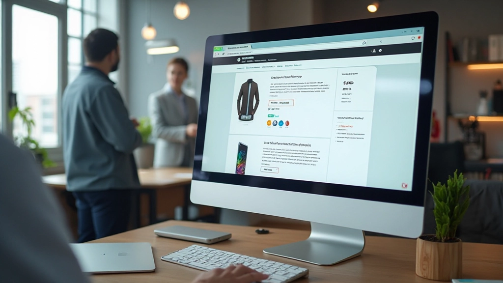
High-Quality Images: Your First Converter
Let’s start with what catches the eye first. Images are where skepticism either melts away or solidifies. You’re not just showing what the product looks like—you’re proving it’s real and worth the price.
Most stores make the mistake of using 3-4 images. That’s not enough. We typically recommend 6-10 images showing: the product from multiple angles, the product in use, close-ups of details, size comparisons, and lifestyle context. When someone can see the product from every angle, they don’t need to email asking questions.
Zoom functionality matters too. Don’t underestimate the power of letting customers examine fine details. A zoomed view of fabric texture or product craftsmanship builds trust that a standard thumbnail never can.
- Include 6-10 high-resolution images minimum
- Show product from multiple angles and in use
- Enable zoom or lightbox viewing
- Use consistent lighting and backgrounds

Description That Actually Sells
This is where you lose people or win them over. A wall of text doesn’t work. Neither does overly technical jargon. What works is clarity with personality.
Structure your description like this: start with what the product is and who it’s for (one sentence). Then the benefit. Then the features. Then the details. Break it into short paragraphs and use bullet points for specifications.
Don’t write “Made from premium cotton blend.” Write “Breathes in summer heat, holds its shape after 50 washes, soft against skin from day one.” Connect features to real benefits. People don’t buy fabric—they buy comfort and durability.
Pro tip: Include a “What’s in the box” section if applicable. Customers worry about missing pieces. Clear expectations mean fewer returns.
Building Trust with Strategic Elements
Conversion isn’t just about presenting your product. It’s about removing doubt. Your customer’s skepticism lives in questions they don’t ask—they just leave.
Strategic placement of trust signals changes this. Shipping information visible before checkout. Return policy clear and easy to find. Customer reviews (real ones, not fake five-star perfection). Maybe a guarantee badge or security seal. These aren’t decorative—they’re objection handlers.
We’ve seen stores add a simple “Ships within 2 business days” notice near the price and watch cart abandonment drop by 8%. That’s because you’re answering an unasked question before it becomes a reason to leave.
Social Proof
Real customer reviews, ratings, and photo testimonials. Not five-star perfection—authentic feedback including constructive comments builds credibility.
Clear Policies
Shipping time, return window, warranty details. Transparency removes the friction that makes people hesitate at the final step.
Security Signals
SSL certificates, payment badges, privacy notices. Visual confirmation that their payment information is safe matters more than you’d think.


The Call-to-Action: Simple but Strategic
Your “Add to Cart” or “Buy Now” button shouldn’t be a surprise at the bottom of the page. It should be visible within the first second, ideally in multiple places: near the price, after the main description, and sticky at the top or bottom on mobile.
Button color matters—it should contrast with your page background and stand out without screaming. The text should be action-oriented and clear. “Add to Cart” works. “Shop Now” works. Vague buttons like “Proceed” don’t.
Here’s something we’ve tested across dozens of stores: price and add-to-cart should be in the same visual zone. When customers have to scroll to see the price, then scroll more to find the button, conversion drops. Keep them together in the hero section.
CTA visible within first viewport
CTA placed near price information
Mobile: sticky CTA at top or bottom
Button color high contrast to page
Multiple CTA placements throughout page
The Elements Work Together
A great product page isn’t about having every element—it’s about having the right elements working together. Images build interest. Description builds confidence. Trust signals remove doubt. CTA makes action easy.
When you structure these correctly, you’re not pushing people to buy. You’re removing the reasons they’d hesitate. That’s what high-converting pages do. They answer questions before they’re asked, remove objections before they’re voiced, and make the purchase feel inevitable rather than uncertain.
Start by auditing your current product pages against these elements. What’s missing? Where’s the friction? Often it’s not about adding more—it’s about organizing what you have in a way that actually guides people toward a purchase decision.


About This Information
This article provides general guidance on product page design based on common ecommerce practices and user behavior patterns. Every business, product category, and customer base is different. What works for one store might need adjustment for another. Test these elements on your own store, monitor your specific conversion metrics, and adapt based on your actual customer behavior. Consider consulting with a web design professional for personalized recommendations specific to your products and target market.