
Essential Elements of High-Converting Product Pages
Learn which page components actually influence purchasing decisions and how to structure them for maximum impact.
Read ArticleOver 70% of online shopping happens on phones. Here’s how to design experiences that work perfectly on small screens.

Your customers aren’t sitting at desks anymore. They’re browsing between meetings, shopping during lunch breaks, checking out products while waiting for coffee. Most importantly, they’re doing it all on their phones. That’s not a trend—it’s reality. If your store doesn’t feel natural on a smartphone, you’re losing sales to competitors who get it right.
Mobile-first design isn’t about making a desktop site smaller. It’s about rethinking your entire store from the ground up, starting with what works best on a 6-inch screen, then expanding from there. The difference is fundamental and it affects everything: navigation, images, buttons, forms, checkout speed.

Mobile-first design rests on four pillars. Get these right and everything else becomes easier.
Users hold phones in their hands, not on desks. Most people use one thumb to navigate. Place your critical buttons—Add to Cart, Checkout, Search—in the lower two-thirds of the screen where thumbs naturally reach. Don’t hide important actions behind a menu at the top.
Mobile screens are tall and narrow. Design layouts that work with vertical scrolling, not against it. Avoid horizontal sliders for products unless absolutely necessary. Stack content vertically and let users scroll down naturally. It’s how they already browse.
Buttons need breathing room. A minimum of 44×44 pixels for any tappable element prevents accidental clicks. Spacing between interactive items matters. When buttons sit too close, users tap the wrong one and get frustrated.
Mobile connections aren’t as fast as office wifi. Every image, every script slows things down. Optimize ruthlessly. A 3-second delay? Users bounce. They’re not waiting around. Compress images, minimize code, lazy-load content below the fold.


A mobile product page is a tight space. You’ve got maybe 3-4 seconds to convince someone to look deeper before they swipe to the next store. Make every pixel count.
Start with a great photo. It’s the first thing they see. Use high-quality images that load fast. Multiple photos are good, but don’t use a carousel that auto-rotates—let users control what they’re seeing. Swipeable galleries work better than sliders because swiping feels natural on phones.
Below the image, show the price and rating immediately. Don’t make them scroll to find cost. Include key details: size options, available colors, stock status. Show this information in a clear list, not buried in paragraphs. Reviews matter. Even a couple of genuine customer comments build trust faster than any marketing copy you could write. Keep reviews short and visible—don’t make users tap to expand them.
The Add to Cart button should be sticky or floating, visible even when scrolling. Make it big. Make it a different color than everything else. Make it impossible to miss. That button is where the conversion happens.


Mobile checkout is where you either win or lose. The slightest friction sends customers away. Make it dead simple.
First rule: fewer steps. Don’t ask for information you don’t absolutely need. Phone number for shipping? Maybe. Birth date? Definitely not. Every field is a reason to abandon. On mobile, people are impatient. They want in and out.
Guest checkout should be the default option. Requiring an account before purchase kills sales. Let them buy as guests first. They can create an account afterward if they want. Mobile keyboards are small and annoying to use. Don’t make people struggle through registration to spend money with you.
Use autofill features. Let browsers remember addresses and payment info. When form fields can auto-populate from saved data, checkout becomes almost instant. Also support mobile payment options: Apple Pay, Google Pay, PayPal. These one-tap payment methods are lifesavers on phones. People complete purchases 30% faster with them.
The shift to mobile is complete. Your store needs to feel at home on a smartphone or you’re already behind. Start with the principles: optimize for thumbs, design for scrolling, make interactions touch-friendly, and prioritize speed.
Test on real devices, not just browser emulators. Sit with a customer using your store on their phone. Watch where they struggle. That’s where your redesign needs to focus. Small improvements add up: a clearer search, a bigger button, faster image loading. They’re the difference between a sale and a lost customer.
Your mobile store isn’t a side project anymore. It’s your main project. Design for mobile first, desktop second. That’s where the money is.
Key Takeaway: Mobile-first design means starting with mobile constraints, then expanding to larger screens. It forces you to prioritize what actually matters and strip away unnecessary complexity. Your mobile store becomes better, faster, and more profitable as a result.
This article provides educational information about mobile-first design principles and best practices for e-commerce stores. The strategies and techniques discussed are based on general industry standards and user experience research. Your specific implementation should account for your unique business needs, target audience, and platform capabilities. Results and outcomes vary based on many factors beyond design alone, including product quality, pricing, marketing, and customer service. For detailed implementation guidance specific to your store, consider consulting with a professional web designer or developer.
Learn which page components actually influence purchasing decisions and how to structure them for maximum impact.
Read Article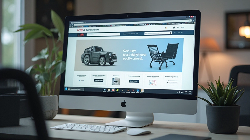
Confusing navigation kills sales. Learn the structural patterns that help customers find products and reach checkout faster.
Read Article
A solid plan prevents costly mistakes later. Walk through the research and planning process that sets up success.
Read Article