
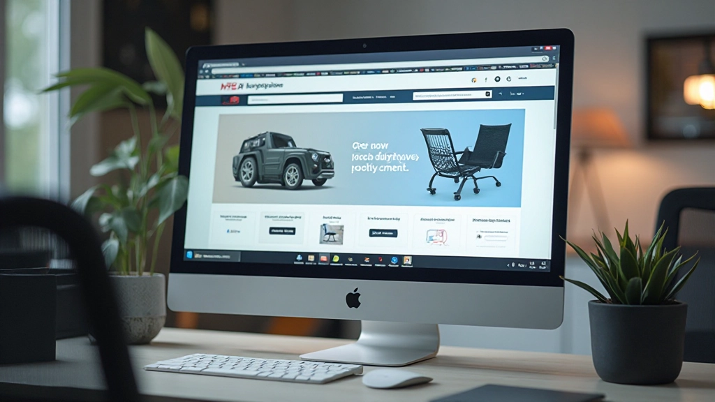
Essential Elements of High-Converting Product Pages
Learn which page components actually influence purchasing decisions and how to structure them for maximum impact.
Read ArticleConfusing navigation kills sales. Learn the structural patterns that help customers find what they want and buy it easily.
Here’s a simple fact: if customers can’t find what they’re looking for, they’ll leave. It’s that straightforward. A well-designed navigation system isn’t just about making your site look organized — it’s about removing friction from the buying journey.
Most store owners focus on products, pricing, and promotions. But navigation? That’s the invisible infrastructure that either supports sales or sabotages them. When your structure is clear, customers move confidently through your store. When it’s confusing, they bounce to your competitors.

Your main navigation needs to answer one question for visitors: “Where do I go to find what I want?” Don’t overthink it. Most successful stores use between 5-8 main categories. More than that? Customers get overwhelmed. Fewer than 5? You’re probably hiding important sections.
Your main menu shows top-level categories. Keep labels clear and specific. “Women’s Clothing” works better than “Apparel.” Your customers shouldn’t need to guess what’s inside.
If you’ve got 20+ product types, mega menus show subcategories on hover. They’re visual, reduce clicks, and let customers preview what’s available without leaving the page.
About 30% of store visitors go straight to search. Make sure it’s prominent, responsive, and actually returns useful results. A broken search bar is worse than having no search bar at all.


Your site structure should work like a pyramid. At the top, you’ve got your homepage. That’s the entry point. From there, visitors move down into category pages, then product pages, then checkout. Each level should feel like a logical next step.
The mistake? Creating too many levels. If it takes 4+ clicks to reach a product, you’ve lost them. Aim for no more than 3 clicks from homepage to product detail. On mobile? Even stricter — keep it to 2-3 touches maximum.
Pro tip: Add breadcrumb navigation on every page below the homepage. “Home > Women’s Clothing > Dresses > Summer Dresses” tells visitors exactly where they are and lets them jump back up the hierarchy without using the back button.
When you’ve got 200 products in one category, filters become essential. Don’t hide them in a dropdown. Put them visibly on the left side of category pages where customers expect to find them. Include filters for price, size, color, brand, and any other attributes that matter for your products.
Here’s what works: show 4-6 filters by default, then add a “More filters” option for advanced users. This approach doesn’t overwhelm casual browsers while giving serious shoppers the precision they need. Update product counts next to each filter so customers know how many items match that option. Nothing’s worse than clicking a filter and getting zero results.
“Good navigation doesn’t announce itself. Customers shouldn’t think about how to find things — they should just find them.”
— Web Design Best Practice


You’ve guided customers through browsing and they’ve added items to their cart. Now don’t lose them in checkout. Use a progress indicator — show “Step 1 of 4: Shipping” or similar. Customers want to know how many steps remain before they’re done.
Make each step focused on one thing. Cart page shows items. Shipping page shows address and delivery options. Payment page handles billing. Don’t mix these. Don’t ask for unnecessary information. Every field you add increases abandonment rates. Studies show that checkout forms with 4+ pages see higher drop-off than single-page checkouts, unless you’re asking complex questions like international shipping details.
Include a “Continue shopping” link on your cart page. Visitors who want to add one more item shouldn’t have to hit the browser back button. Make it easy to return to browsing and then come back to checkout.
Good navigation doesn’t win awards. Customers don’t praise you for having a clear menu. But bad navigation? They’ll definitely notice that. They’ll leave without buying and they probably won’t come back.
Start by mapping out your site structure on paper. Draw boxes for categories and subcategories. Count the clicks needed to reach your best-selling products. If it’s more than 3 clicks, reorganize. Test your navigation with real users — watch how they browse and where they get stuck. That feedback is gold.
Your navigation system should feel invisible because it’s so intuitive. When customers find what they want without thinking about how to navigate, that’s when you’ve got it right. And that’s when sales follow.
This article provides educational information about e-commerce site design and navigation best practices. Results and effectiveness vary based on specific business contexts, products, audience demographics, and implementation details. These guidelines represent general recommendations based on established web design principles and should be adapted to fit your unique store requirements. Every e-commerce business is different — what works for a fashion retailer may not apply the same way to an electronics store. Consider testing these approaches with your actual customers and analyzing your specific metrics (bounce rates, time on site, conversion rates) to determine what’s most effective for your store.
Learn which page components actually influence purchasing decisions and how to structure them for maximum impact.
Read Article
Over 70% of online shopping happens on phones. Here’s how to design experiences that work seamlessly on small screens.
Read Article
A solid plan prevents costly mistakes later. Walk through the research and planning steps that successful stores use.
Read Article